Arts, Beats, & Eats Rebrand
The design for this project was to give the Arts, Beats & Eats identity a rebranding to be more attractive to a younger audience to attend. This involved creating a new logo for use with promotional materials and purchasable souvenirs at the event.
Poster & Logo design
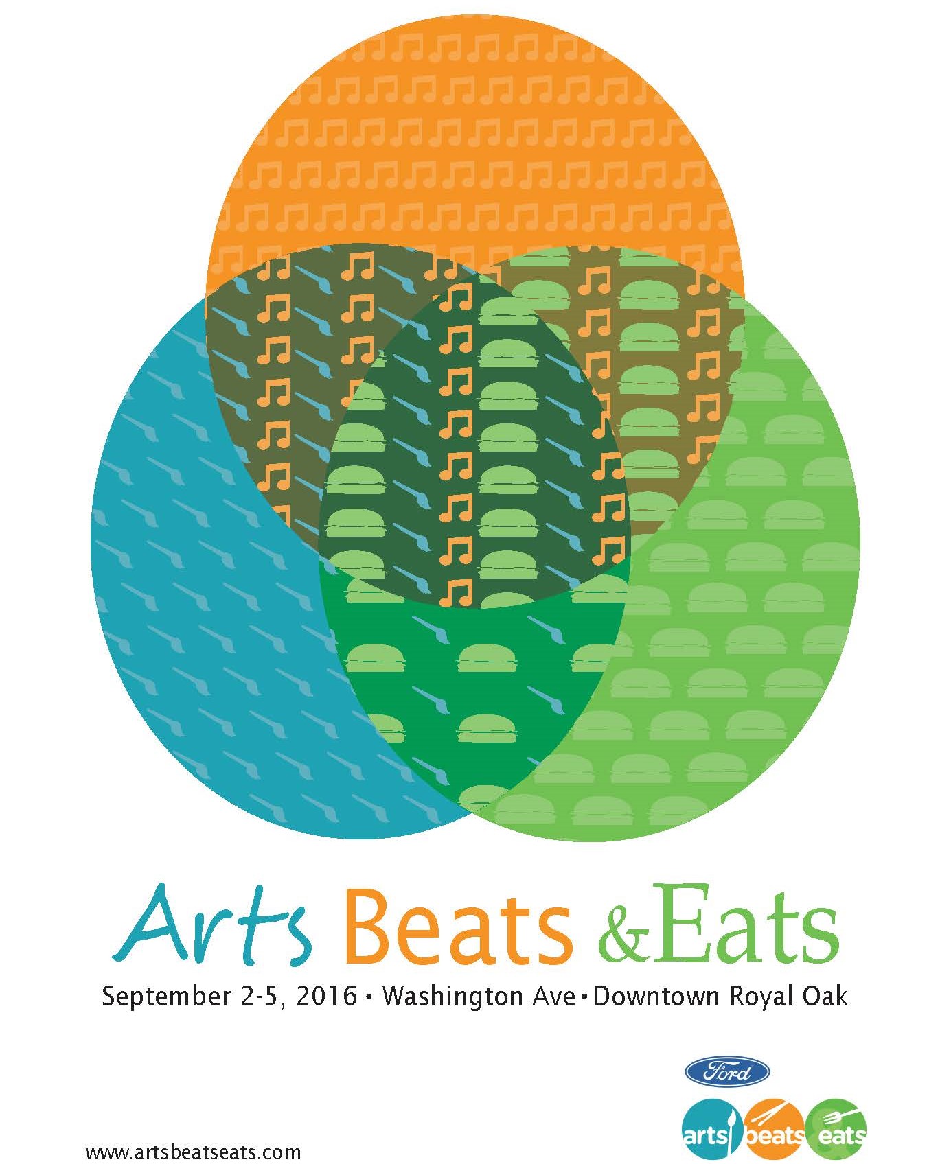
The idea for the poster came from examining the existing logo for the event and combined the 3 circles to create one shape. This shape with overlapping colors is meant to create a sense of cohesiveness through the whole event, making all 3 parts of the name something you can do all at the same time. The addition of flat vector graphics was created to give a greater feel of which circle represented which part of the event and how they overlap and work together.
Brochure Design
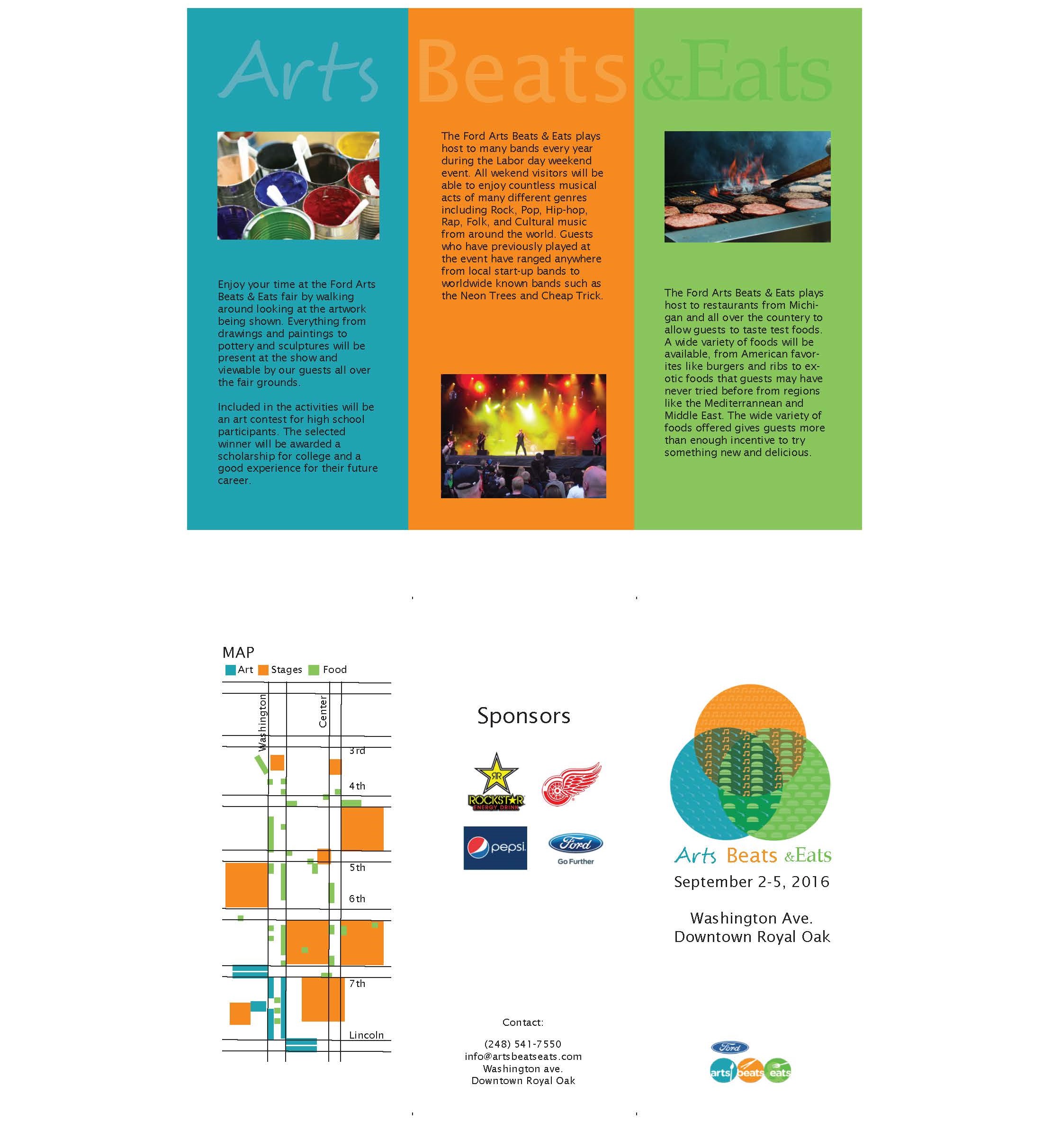
The Brochure has elements of minimalism to help the content pop out to the viewer and make it as clear as possible to read through. Each interior page is color coated to give information of what is available at the event for each category between the three. I also redesigned the event map with the same color coated formula to give the viewer an easy way to find where food was located, where art exhibits were located, and where the stages could be found.
Shirt Designs
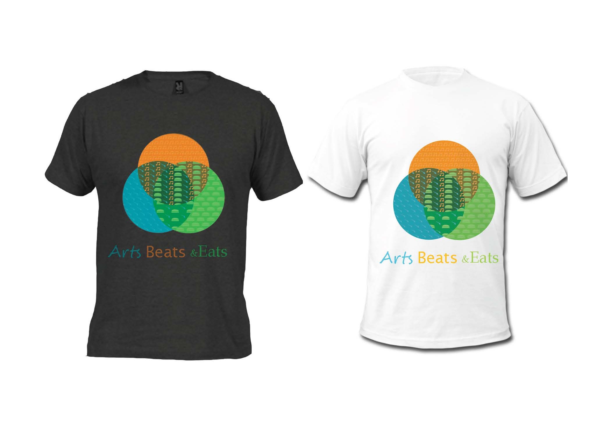
The shirts are designed simple with the newly designed logo displayed on the front. It is a simple design that I would purchase if I saw displayed and designed it thinking other young adults at the event would think the same.
Web Banner Design
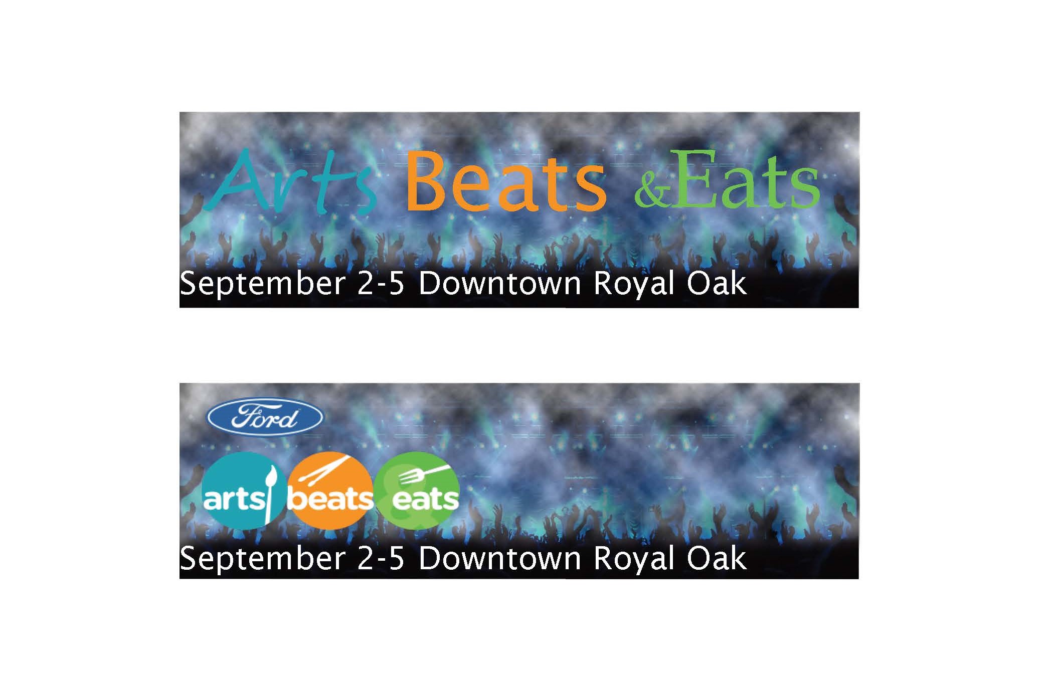
These banners were designed as a way to get a stronger online presence. They use the idea of a concert and party atmosphere to convince younger demographics that this would be a fun event to go to with friends and experience everything there is to offer.
Website Design
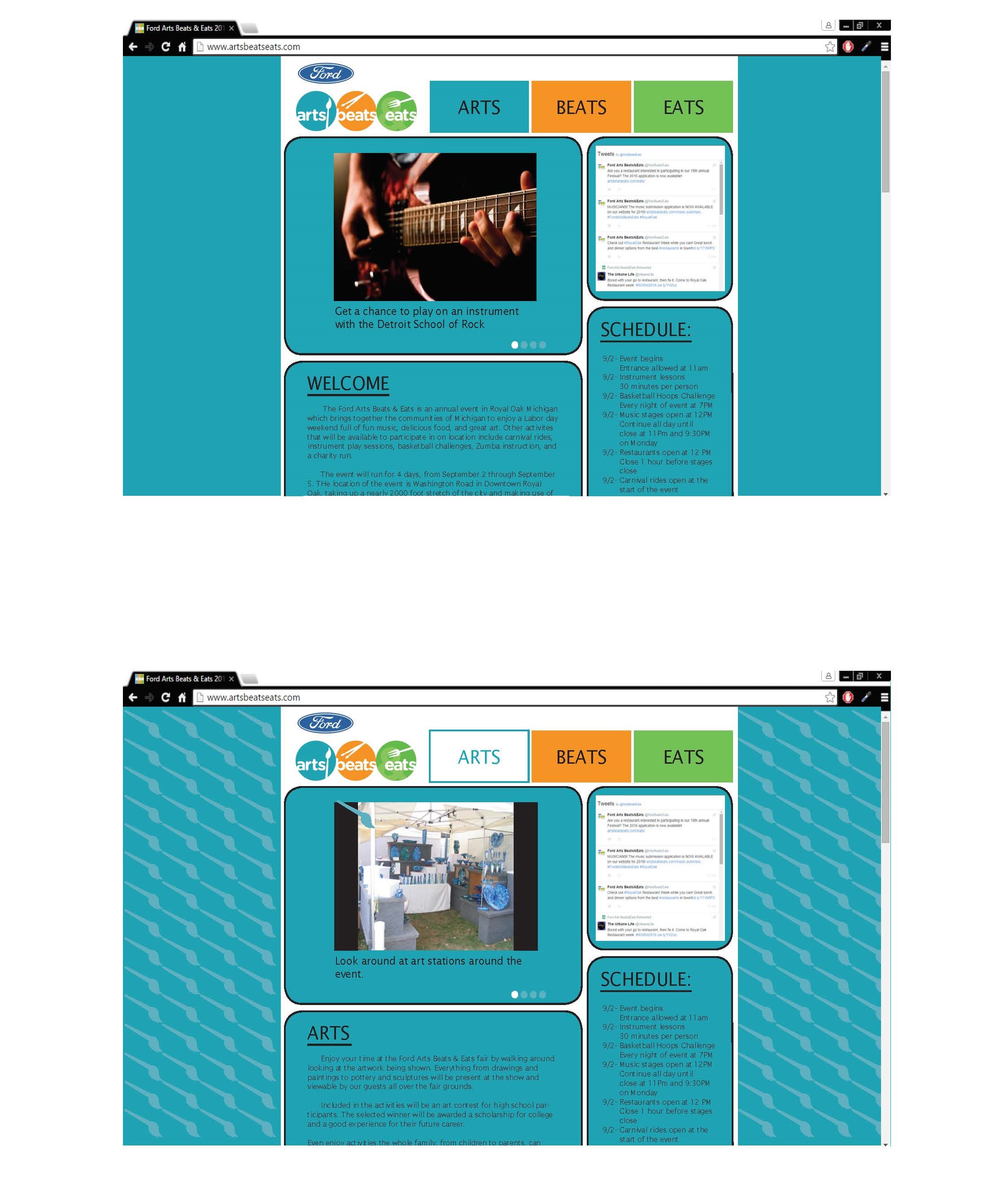
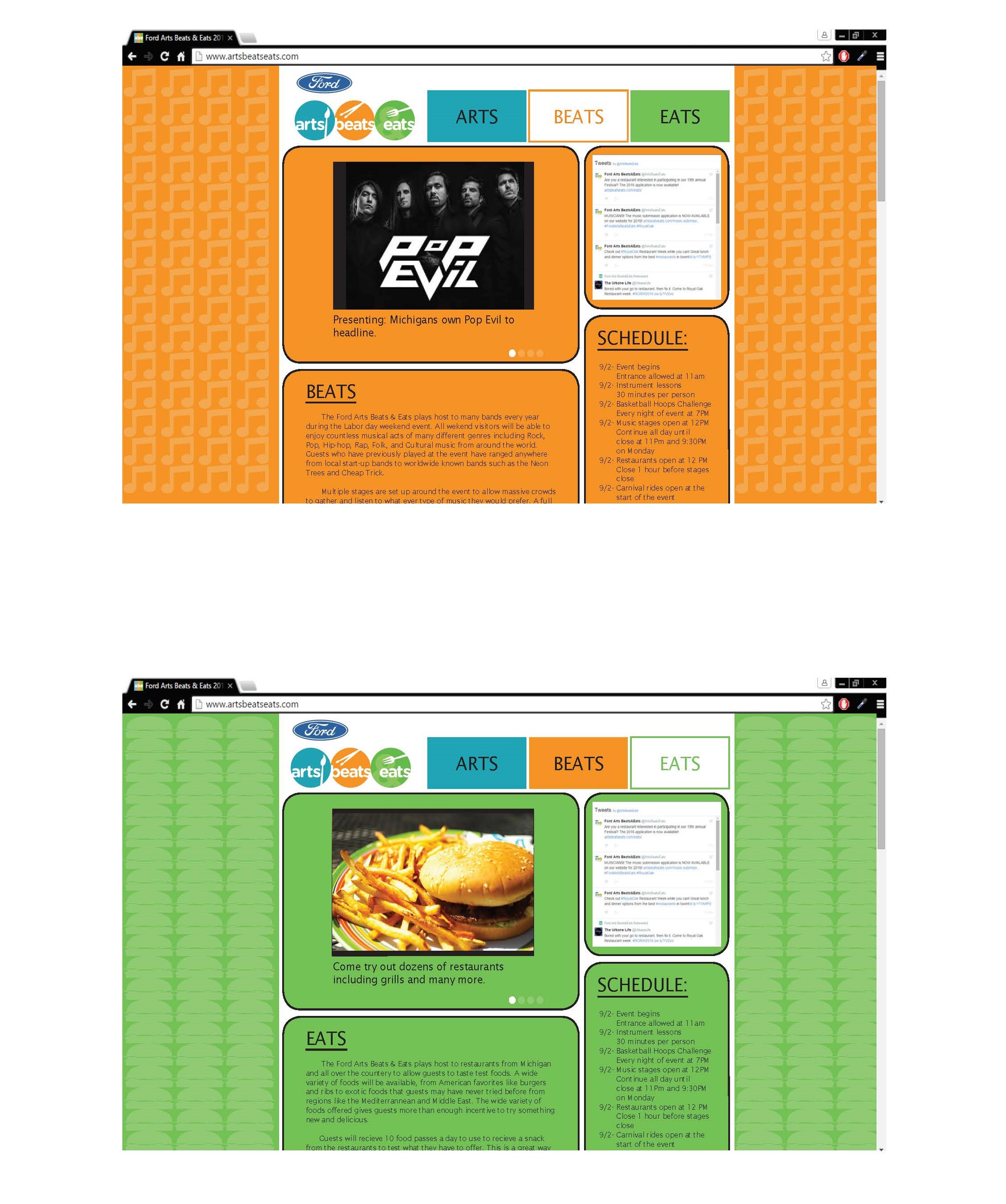
The website was made to highlight the three main attractions of the event first and foremost. Making them especially prominent in the navbar was always and constant idea and continuing with the color coding on each page corresponding with each part of the event. This website design was made to streamline the existing site to make it easier and more enjoyable to find what the viewer would want to see, such as food and music available.
Instagram Ad
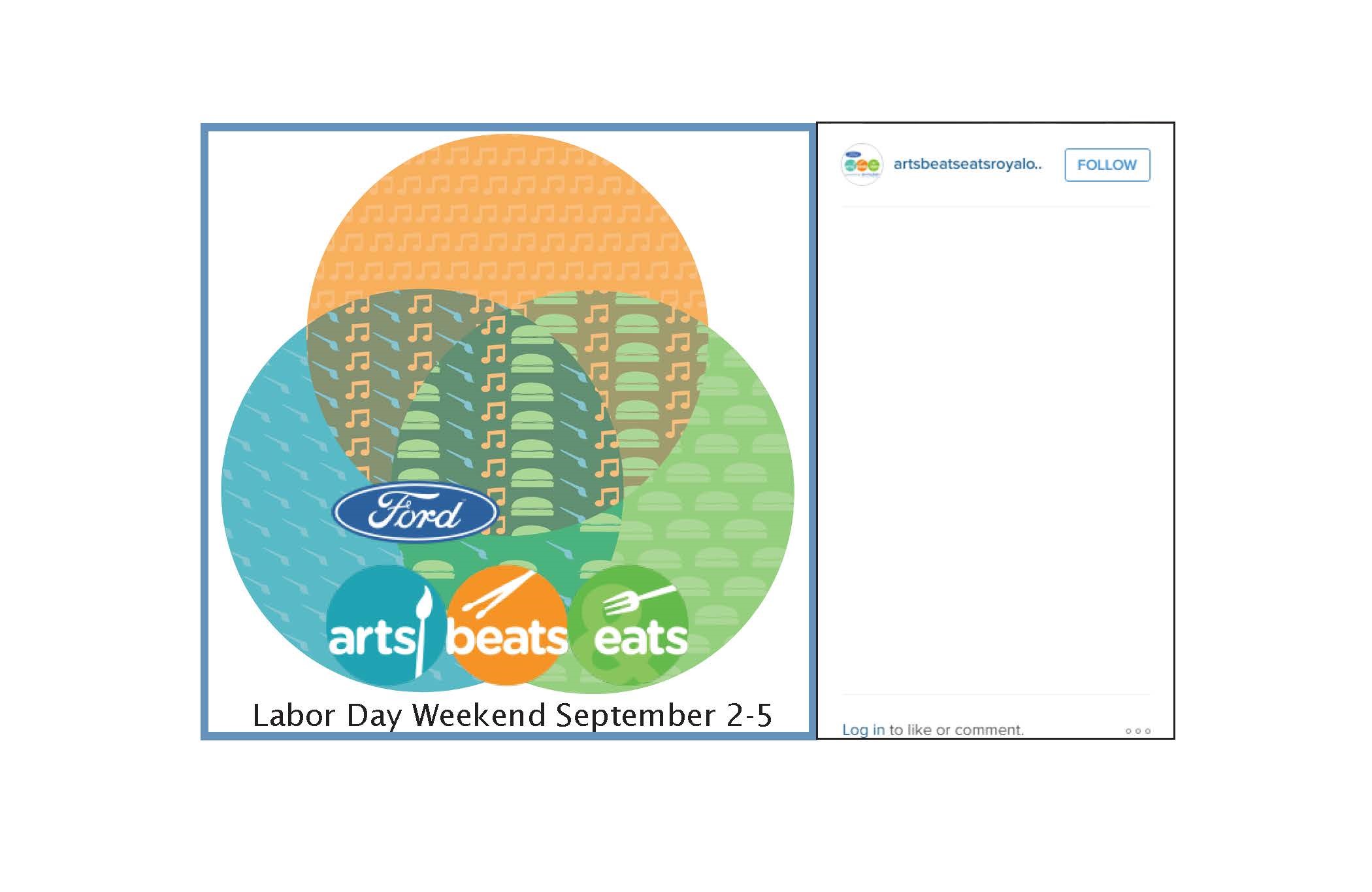
The Instagram ad was another attempt to create an advertisement for social media to attract a younger audience who might not have thought of this as a good option to attend before. It is just a basic ad containing both logos of the event and the dates the event would be running.